Posts

Final

Image
If I don't take this course, I think I will never have a chance to write blogs. I feel it is a very interesting way to record my understanding. Through this course, I get to know a lot of things about art on different sides. Sometimes, I need to do brainstorm to come up with a great concept for my blog. It is an important process, and we want to make our concept attractive and meaningful.  To talk about the most impressive thing, it would be the Gestalt Principles. This topic confused me for a long time, and I did a lot of research to write a blog. It is the most difficult one to understand among these topics that we have during this term. In the text, "Reversible figure/ground occurs when positive and negative elements attract our attention equally and alternately, coming forward, then receding, as our eye perceives one first a dominant and next as subordinate,"(Pg 86) this text is talking about one principle that people can have different results when they are seeing on

Gestalt Principles

Image
At first, I don't really understand what is gestalt principles, so I googled it online. " Gestalt Principles are principles/laws of human perception that describe how humans group similar elements, recognize patterns and simplify complex images when we perceive objects," it says. ( https://www.interaction-design.org/literature/topics/gestalt-principles )  I did some researches on this topic. I would like to talk about the first principle which is Figure-ground, " The figure-ground principle states that  people instinctively perceive objects as either being in the foreground or the background." ( https://www.usertesting.com/blog/gestalt-principles )   People can see several things in the picture, and they will see the first thing that they focus on in the first sight. Then they will say which is the topest layer by their eyes. Here is an example.  https://homes.cs.washington.edu/~xren/research/eccv2006/ For this picture, we can see a man who is playing the instru

Motion

Image
 When I see this chapter, I know what I should say at this time. I have a treasure with the app which is called Picsart. It is a very useful app to edit your photo.  There is a effect which has a lot of choices to make the photos blurred. Here is one I always used which is Motion Blur. We can change the distance, angle, and fade to have different effect.  These are three photos which are the same with different effects. The first one is the original photo. I use the Motion Blur in the other two but different distance. We can see the difference clearly. People try to use this effect to stimulate when they are taking the photo, their camera is moving inteniously. I think sometimes proper blurred can make the photo have the beauty of indistinction.  In additional, animation is also based on motion of pictures. In page 222, "Like film and other 'motion pictures,' animation uses sequence of still images to create the optical illusion of movement." When the picture changes

Diagram

Image
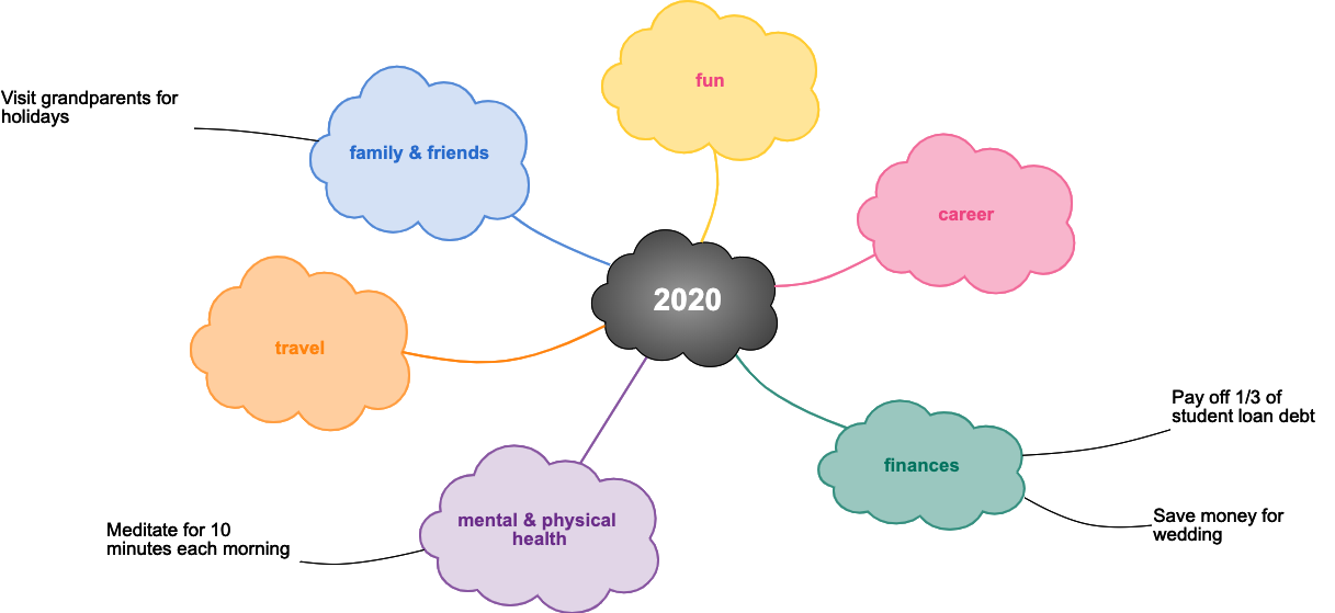
 This week I would like to talk about diagram. Diagram is always very clear and direct. It is easy for people to understand. I would like to use diagram when reviewing the study. I will write down the important point and make the diagram to connect them. It can also help me to memorize. If I am familiar with the graph, I will remember them quickly on the exam. For example, I think mind map is a kind of diagram. People can use mind map to record their life and their future.  https://cacoo.com/blog/mind-map-way-successful-year/ In this mind map, we can see the author divide this year to several sides. She has plans on these sides. I have made one like this before, and it has plenty of details. But unfortunately, I didn't use it because from the beginning of this year, everything was different from what I planed. A lot of unexpected things happened, and everything was out of track.  When I was searching mind map to find some interesting examples, I saw this one. I think it is very ing

Pattern

Image
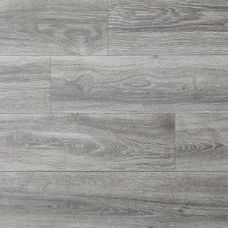
In our daily life, we can always see a lot of pattern everywhere. The most common pattern is geometric figure.  Geometric shapes  are shapes made out of points and lines including the triangle, square, and circle. They can create more complex patterns to make pretty pictures.  For example, they are always used on the floor and the wall.  In these two photos, they are both made of rectangle. The things that made of geometric figures will look pretty neat.  The traffic warning sign are also made of geometric figures. 

Layers

Image
As we know, to make a great 3D artwork, one important thing is to have a sense of space. To achieve that, layers can help a lot. We can create several layers to make the images at the front or back. Then we will have order and sense within an image.  Here is an example that I made for 3D.  I have had five layers when making this work. To make the sense of 3D, I chose a floor and wall background first to be the foundation. After selecting several images and ordering them together, the work has a sense of space.  In addition, when people are editing their photos, they would like to pick some stickers to make the photo look pretty and attractive. I would like to post one of my selfies to show how it works.  For this photo, my original photo is the background, and all the layers are at the front. It does have a lot of layers, and I add a lot of stickers. One sticker is on one layer. The idea is that I don't want my photo to look very plain and boring, that's why I make it this way.

Framing

Image
 To make a great picture, framing is a very important element. If you want to take a photo of yourself, you need to make the frame look very harmonious. Most photos that I like look simple, and they don't have too much messy stuff.  As we know, it has a grid when we use the camera on the phone. It has three rows of three columns. We can have a good framing by using this grid.  https://m.weibo.cn/5321997707/4563164630618843 https://m.weibo.cn/3480128977/4563229910502146 https://m.weibo.cn/6368224499/4562525088391344 The focus points of these three photos are all at the bottom of them---the second rows and the third rows. They have appropriate blanks on the top. That makes the photos look very neat, and people can pay attention to the focus point immediately.  Also, the focus point can be placed on the right side of the photo---the second and third columns. I have a small skill in taking photos of people. If we put the figure in the lower two rows and let feet reach the lower line, i